Botivation is a beauty shopping app that helps users discover personalized skincare products through a fun quiz and clear, easy-to-understand ingredient insights.
Timeline
SEP - DEC 2024
Roll
UI Design, UX Design, User Research
Team
1 Motion Designer
Project Overview
What is Botivation?
“Botivation” blends Beauty and Motivation.
It’s a concept that empowers users to discover skincare products tailored to their unique skin type while inspiring them to stay motivated on their personal beauty journey.
Problem
By conducting 10 user interviews with individuals who frequently shop at competitors like Sephora and Beauty Bay, I gathered qualitative insights about key pain points.
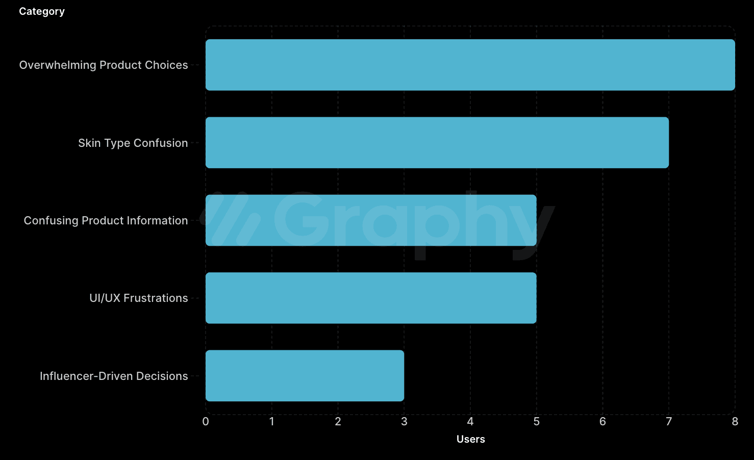
Key Insights
Through the interviews, I found some key insights.
Which Skin Type Am I ?

Users aren’t sure about their skin type, which makes it tough to know which products will actually work for them.
Unclear Ingredients, Unclear Decisions

Users struggle to understand product information, making it difficult to choose the right skincare for their needs.
Design Challenge
How can I help skincare shoppers find the right products
without feeling overwhelmed?

How I Solved the Problem?


User Analysis
Who uses Botivation?
I focused on two core user groups, those who are passionate about skincare and those who are just beginning their skincare journey.

User Journey Map
Based on desk research, I created an user journey map of the target users (persona). The map reveals key moments when users engage with skincare and highlights their needs and pain points.

Key insight
As a result, I found that Users feel overwhelmed at the start due to unclear skin type and product info. Personalized guidance and ingredient clarity help build confidence and support better decisions.
Design Decision
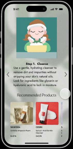
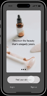
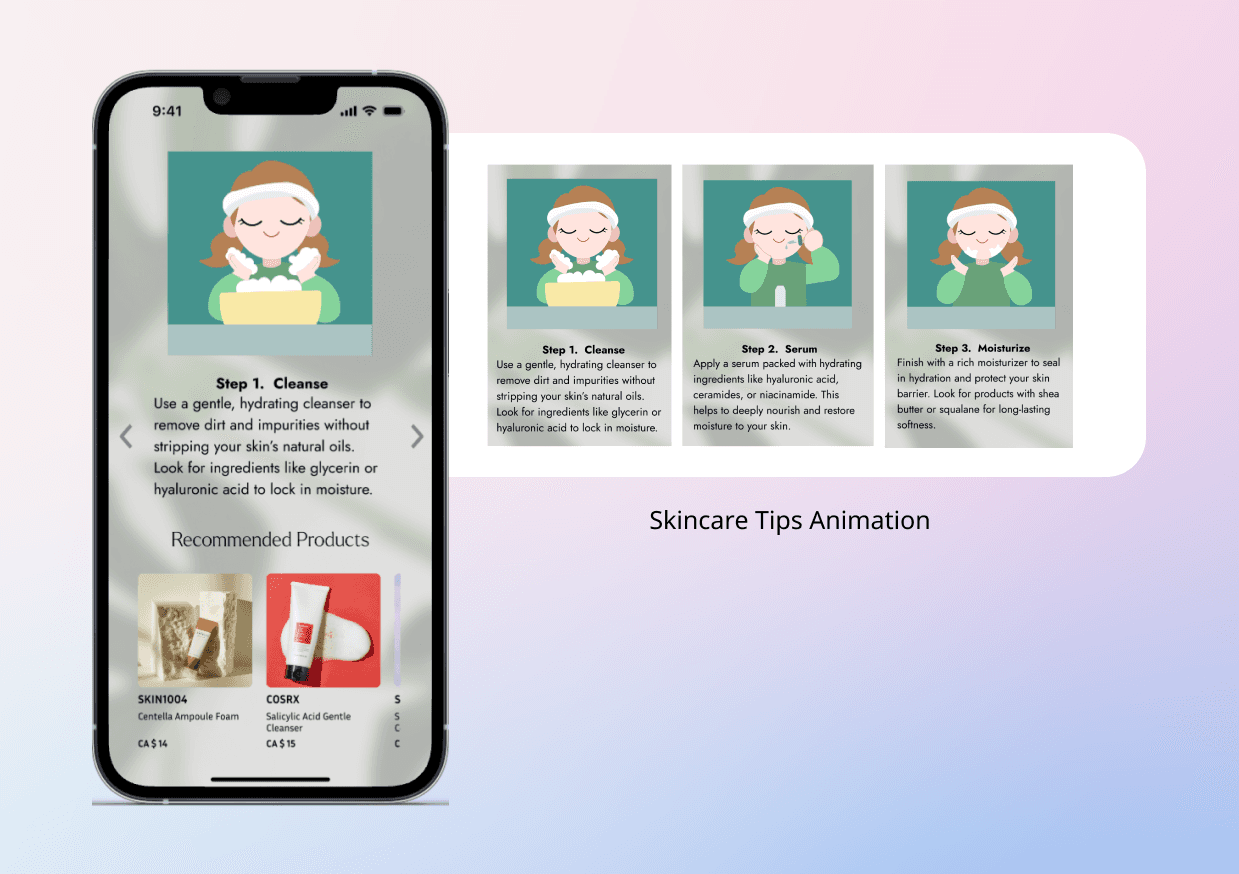
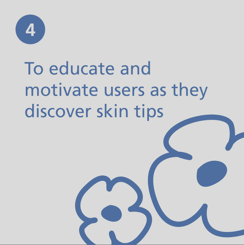
I proposed four key features based on user needs. Through this app, users can confidently discover products that suit their unique skin type.


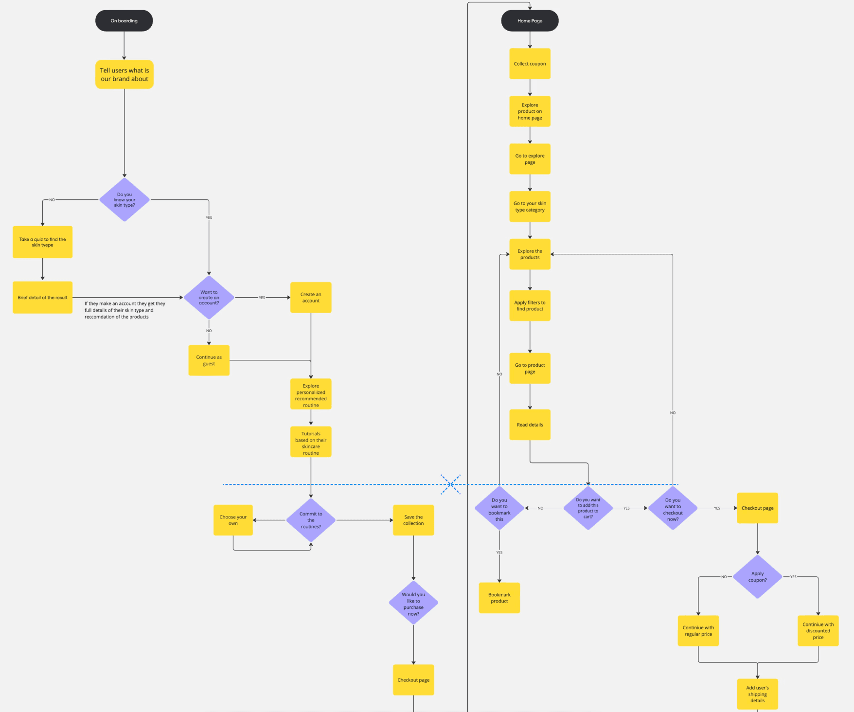
Information Architecture
I organized the overall flow with the information architecture as below, thinking about how to deliver the 4 main features to users.
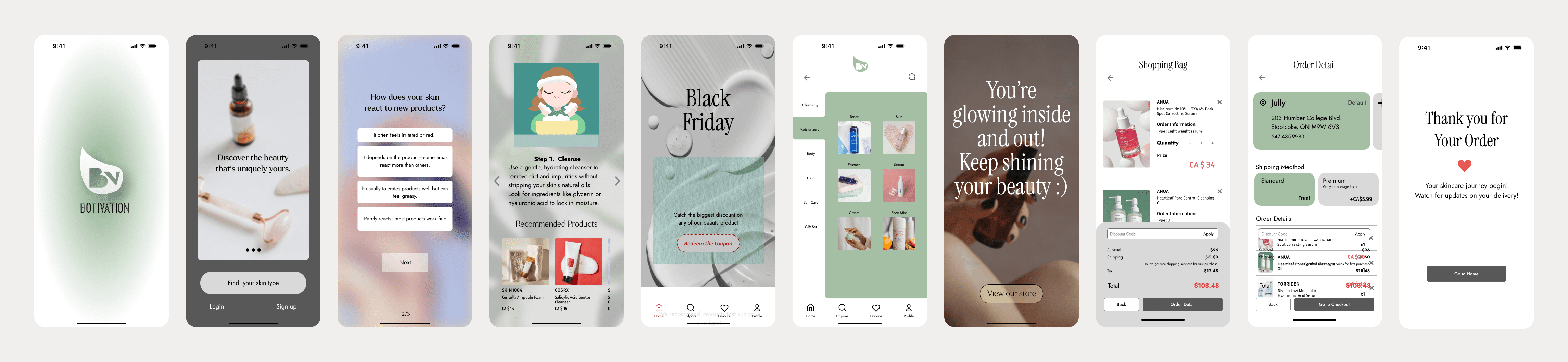
Wireframe & Prototype
I created multiple wireframes based on the information architecture (IA) to guide users smoothly through the experience, focusing on clarity, ease of navigation, and personalized product discovery.

Usability test
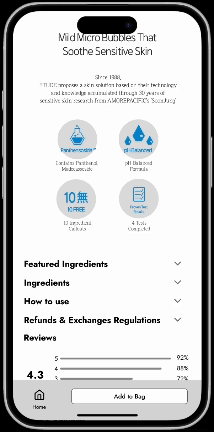
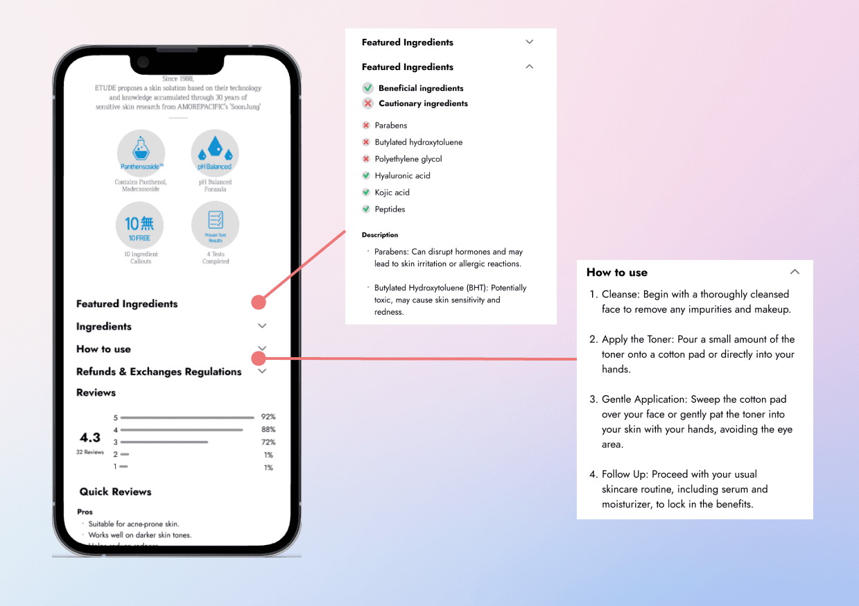
Since a core feature of this project is helping users understand beauty product ingredients to make smarter purchasing decisions, the presentation of product information became a key focus.
So I tested A/B testing on two different ways of presenting product information, using qualitative methods to measure impact.
A. Product info as detailed text
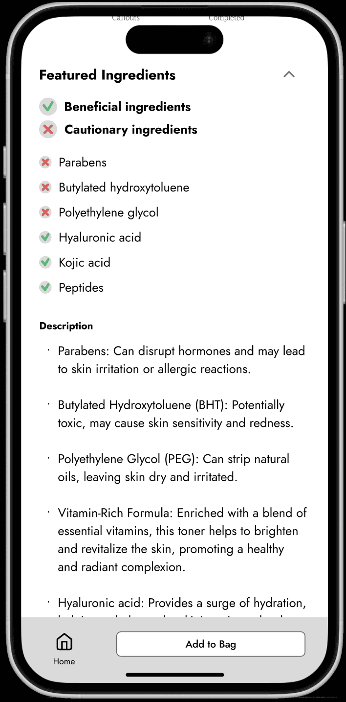
✅ Clearly presents ingredient information
✅ Provides detailed explanations
⚠️ Text-heavy information delivery.
⚠️ Users may have difficulty quickly grasping the product’s core value
B. Show product info with icons
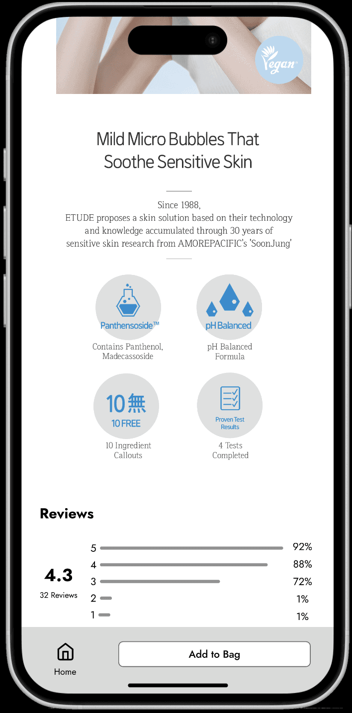
✅ Uses visual icons to make information delivery more intuitive
✅ Highlights key benefits
⚠️ Lacks ingredient details, making it hard for sensitive skin users to find the necessary information
⚠️ No in-depth explanations of the actual ingredients and their effects
Key insight
However, the results showed no significant difference between the two approaches. To understand why the impact was neutral, I conducted interview to get qualitative research, which revealed that long-form text did not provide a significantly stronger impact.


Next Step
➡️ Redesign product pages using icons, tags, and interactive elements to simplify ingredient information. ➡️ Conduct usability testing with visual-first layouts to validate effectiveness.
➡️ Explore micro-interactions or tooltips to offer optional in-depth info without overwhelming users.
Reflection
User Testing That Drives Real Impact!
This project reinforced how crucial it is to design with the user in mind. Through user research and usability testing, I realized that understanding the user's pain points and needs directly influenced how effective the final design would be. By truly listening to users and their struggles with skincare choices, I was able to build a solution that was both intuitive and impactful.
Quantitative Data Informed Design Decisions.
I gained deeper insights into how quantitative data (such as A/B testing) can guide design decisions. Through the testing phases, I was able to confirm hypotheses and refine features based on real user behavior, not just assumptions. This data-driven approach helped me make design choices that were backed by evidence and truly aligned with user preferences.
Always Iterating, Always Improving.
One of the biggest takeaways was how iteration can elevate a product. By regularly testing and refining wireframes and user flows, I was able to identify potential issues early and make improvements before moving to high-fidelity designs. This iterative process not only made the design more user-friendly but also ensured that the end result addressed real user needs.